
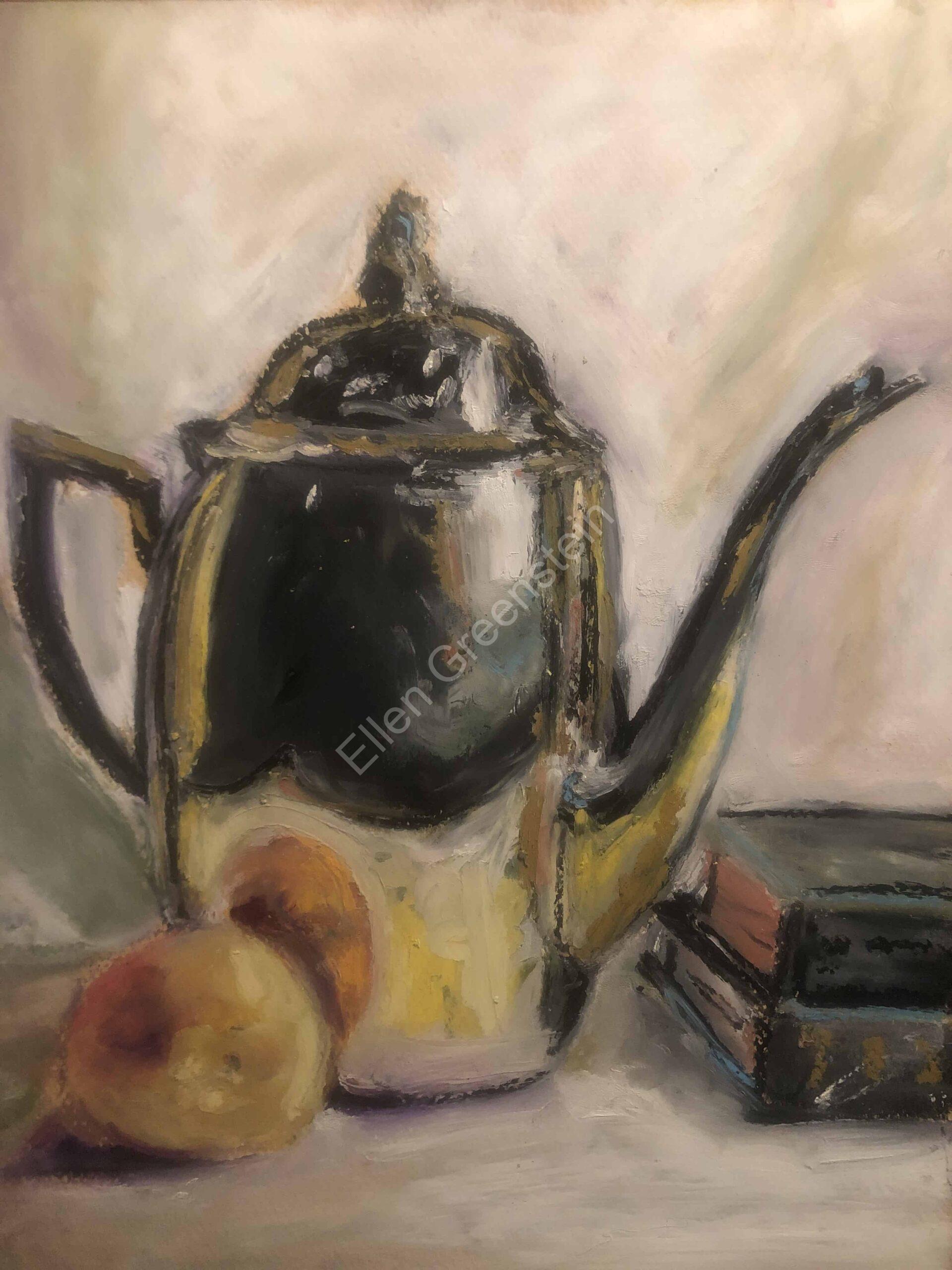
Reflections have always fascinated me. The oily rainbow puddles that formed near the curb when it rained and Cloud Gate—Anish Kapoor’s giant mylar-like sculpture in Chicago’s Memorial Park are just two examples which draw my eye.
The way everything gets distorted in rounded objects and how light bounces off various types of metals are two aspects of reflections which captivate me. I enjoy looking at the artwork of Janet Fish where she explores how light interacts and plays off of everyday objects. I love experimenting with how light bounces off of various fruits: the dimpled citrus skins of oranges and lemons; the high shine of an apple. A year ago I discovered how much I enjoy drawing metals—especially copper. There is something about copper which is warming and cozy. Objects reflected in copper take on the same warmth and rosiness. Depicting exactly where the light bounces off the edge of a metal object gives me great pleasure. Similarly, I love exploring those places where little or no light has found its way in. My eyes like to travel over the cast shadows of objects and the peculiar and interesting shapes they make. Their edges can be as sharp as a razor or blurred and faded. Interpreting these qualities and nuances onto my paper is an enjoyable challenge.
My cast shadows are rarely black. Black shadows are dull and boring. Through experimentation I have found that my shadows can be various shades of grey, purple, blue and even burgundy. They all still read as “shadow”.
Though many users of oil pastels will use a blending stump, I much prefer to use my fingers to blend. The beauty of good quality oil pastels is their creaminess and therefore, their blendability. One of my favorite parts of the drawing process is looking at the shadows and reflections in front of me and then trying to figure out my color palette. The colors I end up choosing are often not representative of the study before me, but they express my feelings about that subject at the time of my drawing.